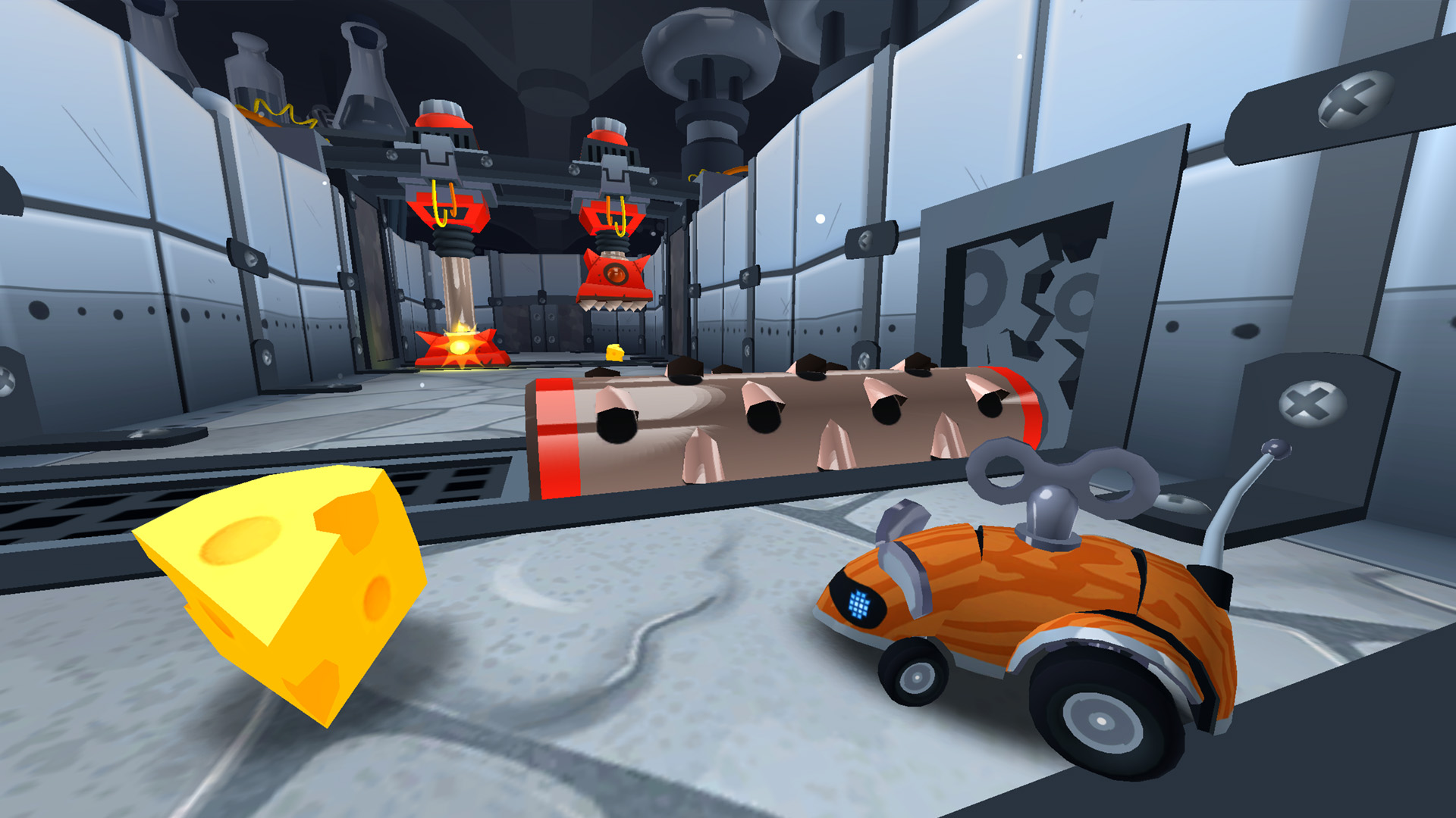
After spending some quality time in the meeting room, bouncing around gameplay ideas and grandiose pipe dreams of what our next game could be, we landed on the idea of a constantly moving driving platformer. It would be an experiment with multiple terrain types (land and water) and would include some sort of jumping and danger element. We eventually whittled it down to a mouse stuck in a trap-ridden maze, gathering cheese.
It was a simple idea that had a lot of potential to go in various directions. We have always enjoyed adding a bit of soft humor into our games, and found the cat-and-mouse dynamic to fit perfectly within our style. We knew it was the right idea when we couldn't stop giggling.
This article focuses on how we came up with the visual design. I’ll talk more later in another article about other design and technical challenges we had to overcome while making MouseBot: Escape From CatLab.
We liked the idea of using inspiration from classic cartoons. At the very heart was Wile E. Coyote and Road Runner solely for their cat-and-mouse character dynamic. Looney Toons had the perfect amount of silliness and weirdness to their comedy. Pinky and the Brain was another obvious choice.
Pinky and the Brain © Warner Bros.
For our environments, we wanted to layer in as many call-outs to our world as we could squeak in. Pixar has always done a terrific job at layering in small details which allow the environment to speak for itself; some of my favorite examples are Cars and Monsters University. I would have loved to have thrown in more stuff like this if we had the time to concept more thoroughly.
Monsters University concept art by John Nevarez highlighting the faux teeth and eyes blended into the shape language of the architecture
But given our timeframe, we worked to have as many subtle references to our characters or silly jokes that we could think of. If these dumb cats were really scientists, what would their lab look like? We threw in small repeatable props like yarn, cat toys, and tuna cans.
How would cats build these traps? We used the fiction of the ACME brand for nostalgic reasons, but it also helped feed into the fiction of the game. The setting of Mousebot changes from a modern clean lab, to a retro black and white mad scientists’ lair, to a dusty makers’ garage. So in our mind, these different cats in their different lab settings all had the same style traps because they were bought by ACME, this is why there are ACME boxes laying around in the background. They were still slammed together by cats with no opposable thumbs, so they weren't screwed together quite straight. They still had to look menacing to a mouse, which is where the straight-up mouse traps, giant rolling cheese graters, and abstracted cat-faced stompers came in. The small background stories we came up with made it easier to flesh out details and also inspires the player to interpret their own.
Once we decided to make the mouse a robot, that opened up a lot of fun opportunities. A robotic mouse can explode into a mess of servos and screws. It also influenced us to take a more robotic, mechanical approach to the overall visual style. Thinking of ways to emphasize the small scale of the mouse was important. Things like nuts and bolts, batteries, cat toys, and other easily recognizable small objects had to be repeated often in order to cement this miniature world.
Our UI was the final thing that brought everything together. The cat characters were added to the tutorials, mirroring their appearance from the mini-cutscenes. The laboratory theme was spread through the menus; like the beaker for the cheese meter, or the clipboard for your rewards at the end of the game.
Adding themed or pun-based names to the traps and world settings helped further cement our world-building. I’m personally a huge fan of really lame puns and play-on-words. There is such little text, we wanted it all to be part of the overall theme. “Having a Blast” is the name of the world that proximity mines are introduced in. ”The Puss and the Pendulum”, was named after Edgar Allen Poe’s Pit and the Pendulum. “Big Paws” and “Small Paws” are the names to our differently sized touch control configurations.
Overall, we went with what felt right and what gave us the most satisfaction to make. We took from things that inspired us directly. One of the benefits of a small company is that everyone has a voice that is heard, and has valuable input that is taken seriously. We trust our team's instincts: if we have fun building it, there must be something to it, right?


